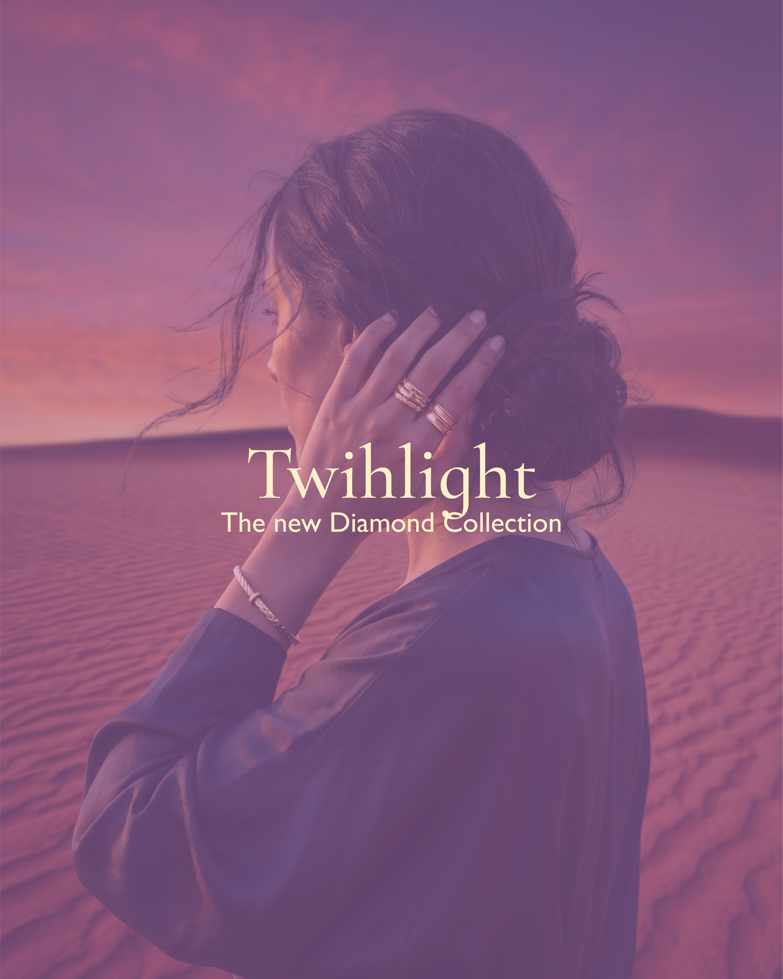
Brand Restyling & Visual Direction Concept.
L’AZURDE is a fashion jewelry brand inspired by Middle Eastern aesthetics, balancing tradition and modern femininity.
This project focuses on the development of a new color palette, a new website design, and a new visual direction for the brand as part of the recruitment competition for ASTUDIO.
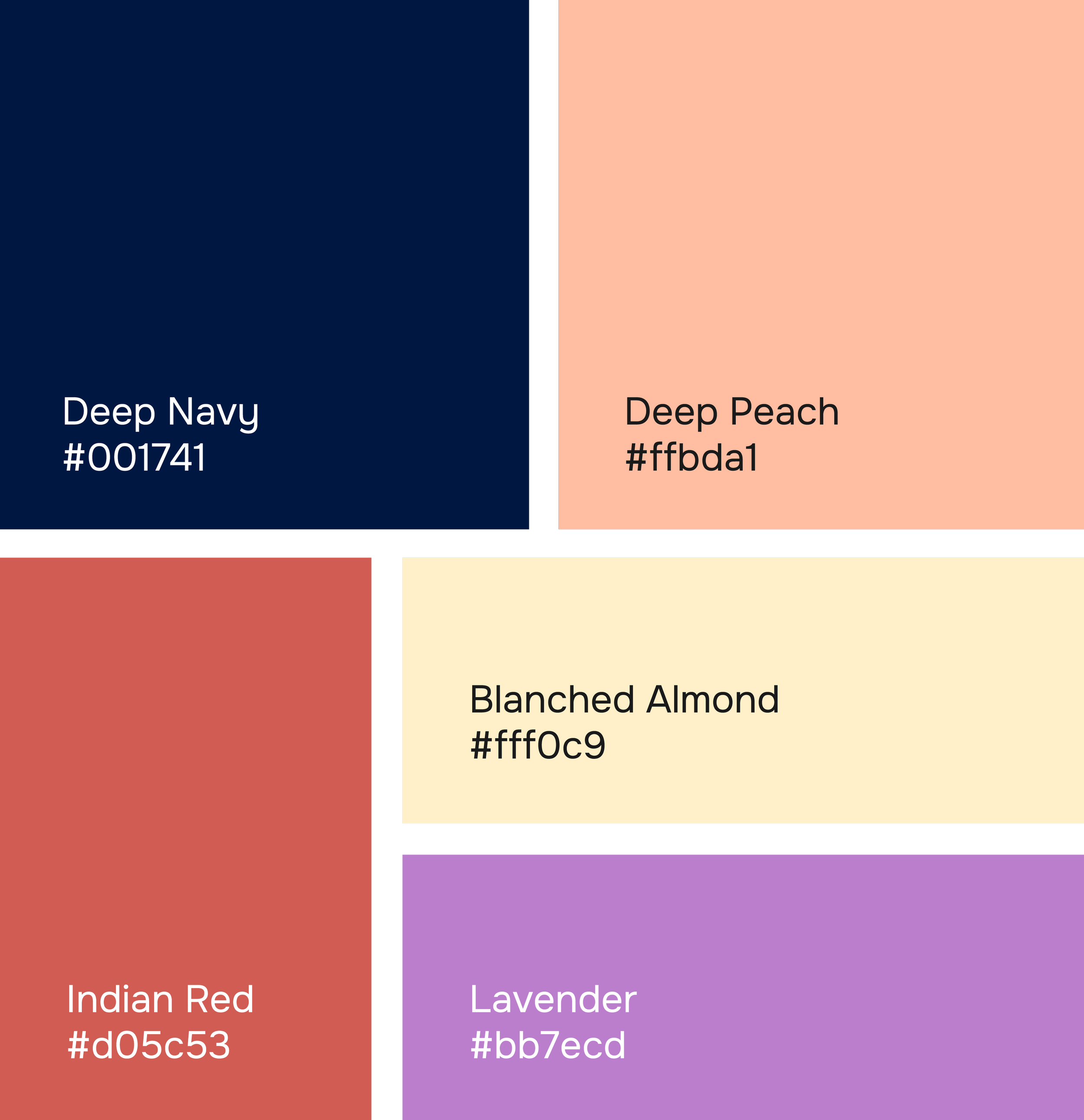
Color palette
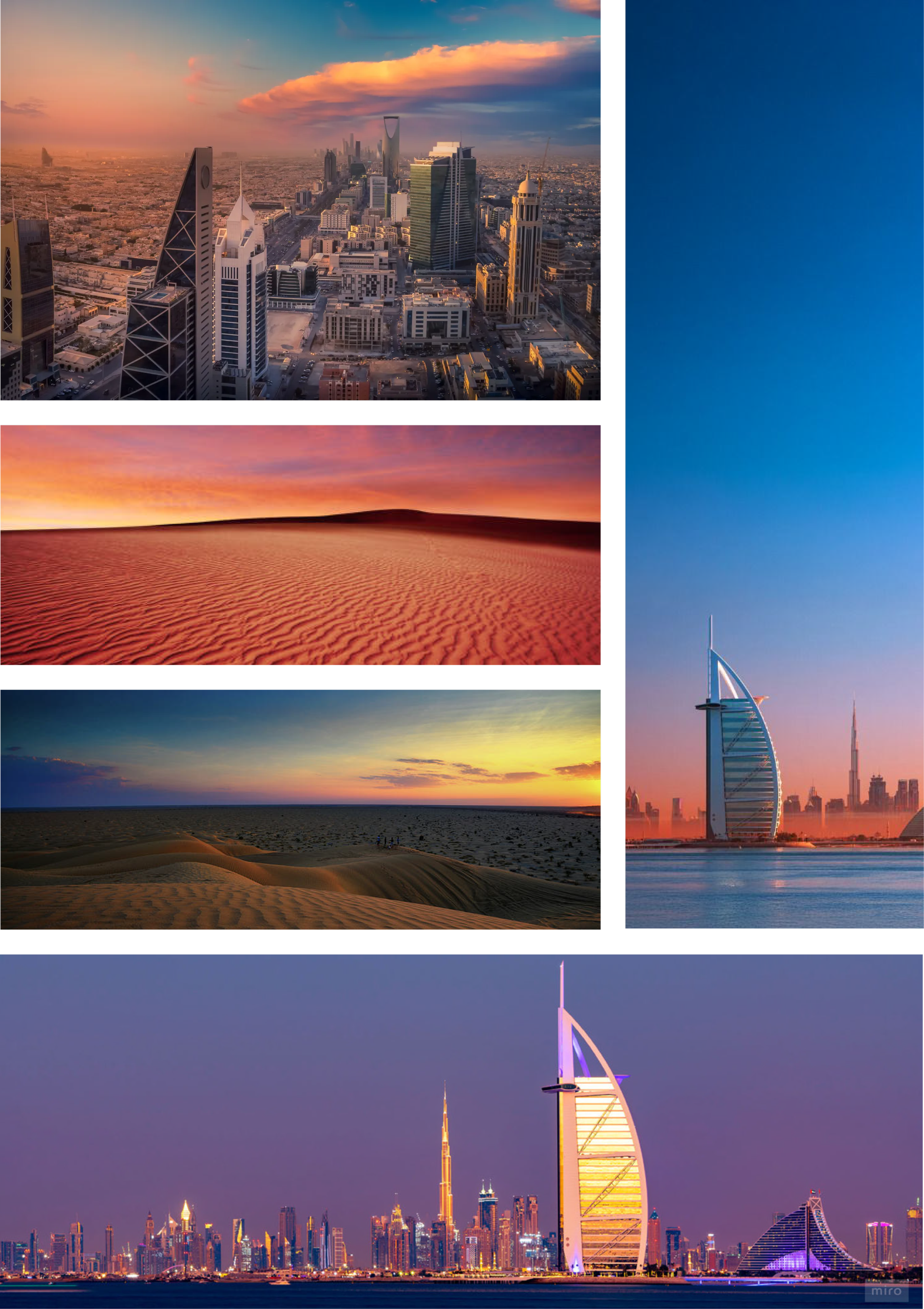
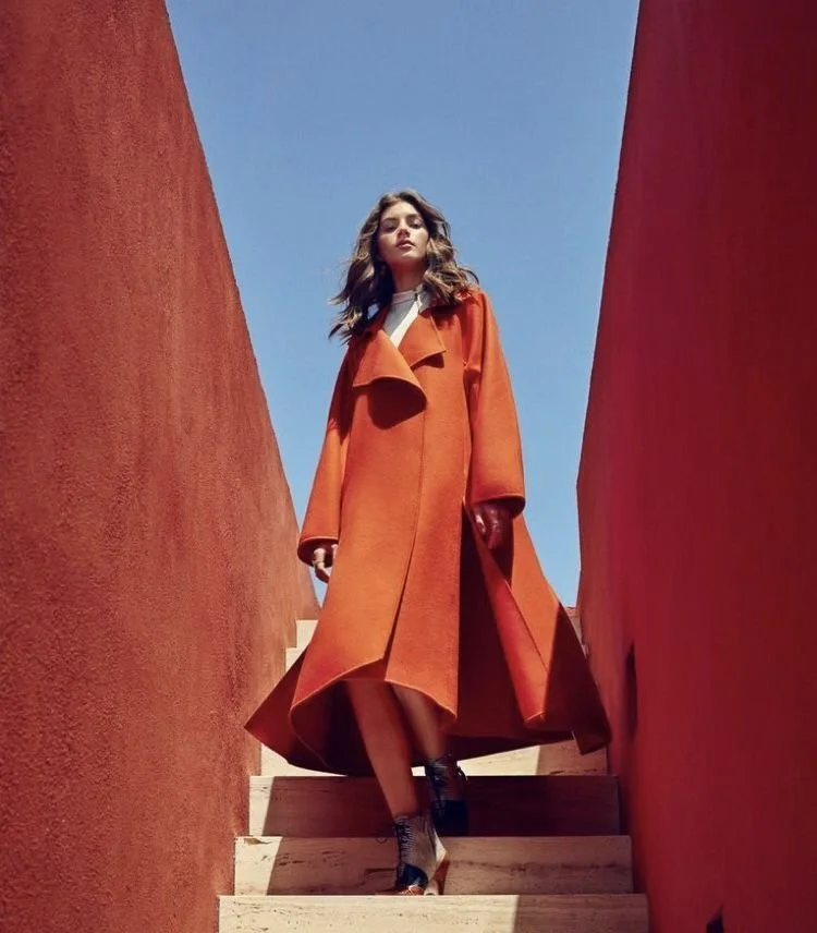
The color palette was inspired by the colors of the sunset sky over Dubai, Riyadh, and the Arabian Peninsula as a whole.

Typeface
Used for: Headlines&Accents
Style: elegant, expressive, ornamental
A refined serif typeface with flowing, calligraphic details that subtly echo the rhythm of Arabic script. It brings a sense of elegance, tradition, and cultural nuance to the visual identity.

Used for: Body text&Details
Style: clean, modern, timeless
A modern and versatile sans-serif that ensures readability and visual harmony. Its simplicity provides a contemporary counterbalance to the expressive nature of the primary font.
Web site
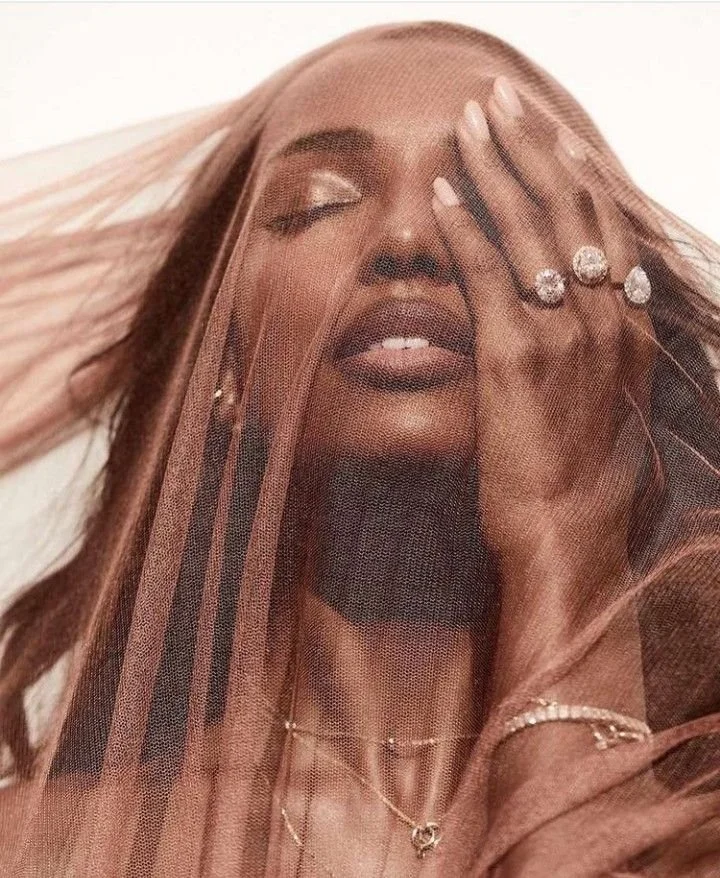
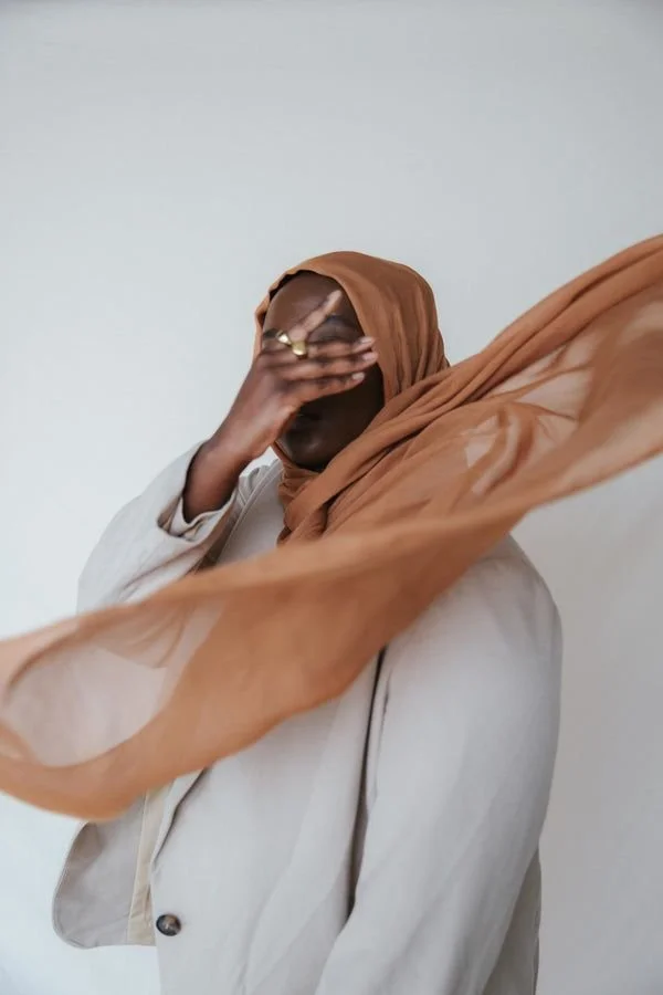
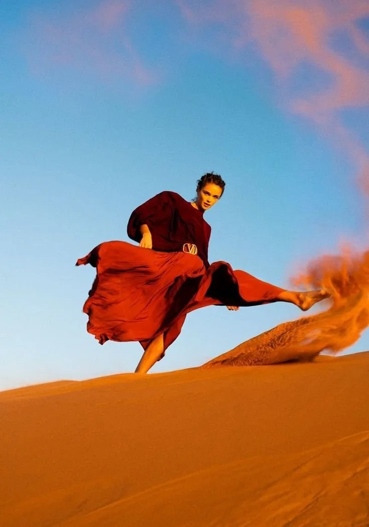
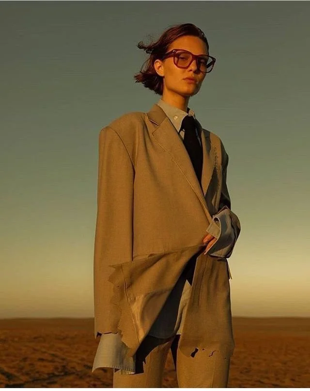
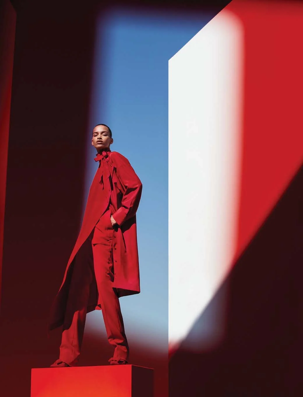
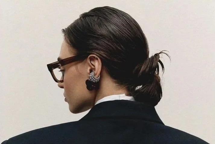
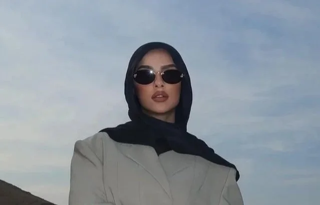
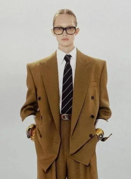
Visual Art Direction
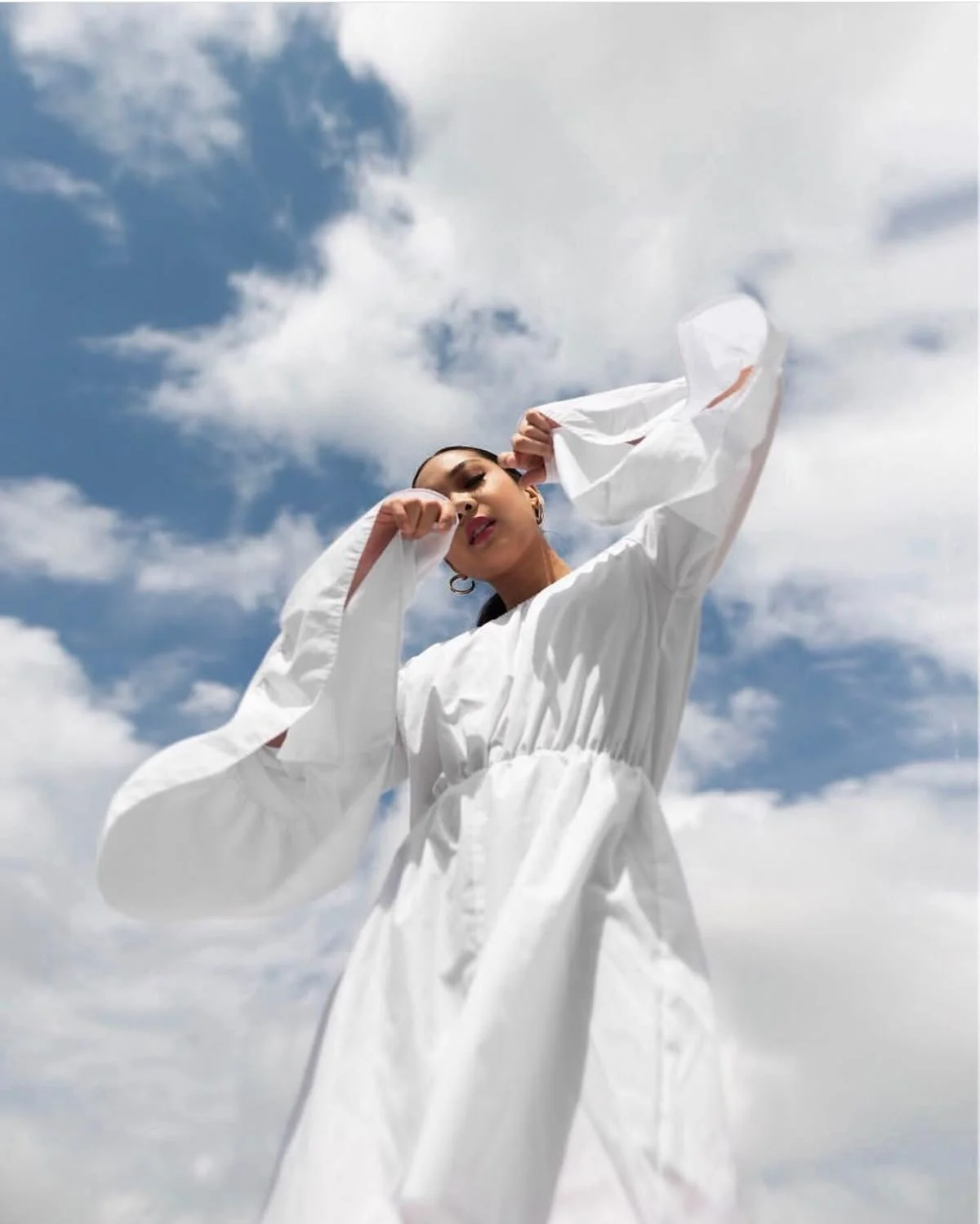
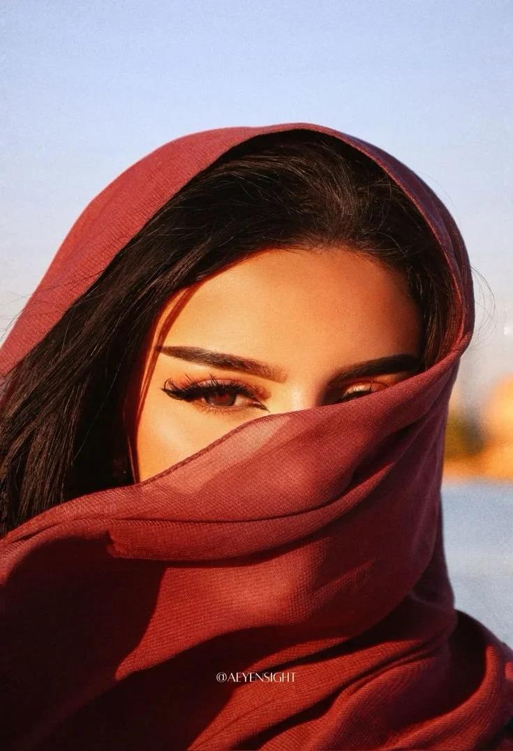
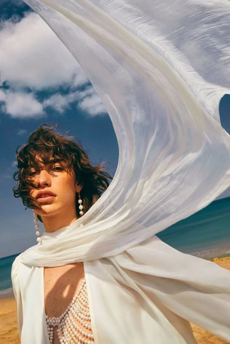
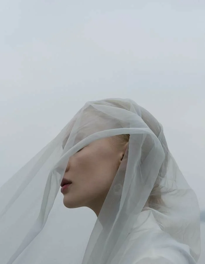
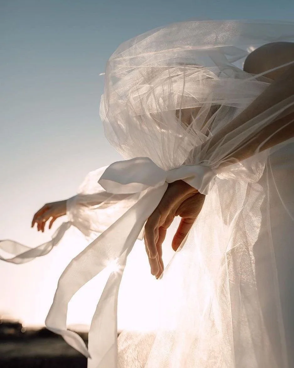
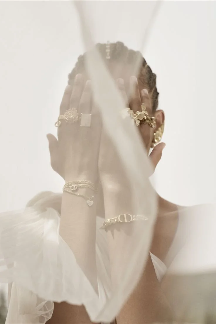
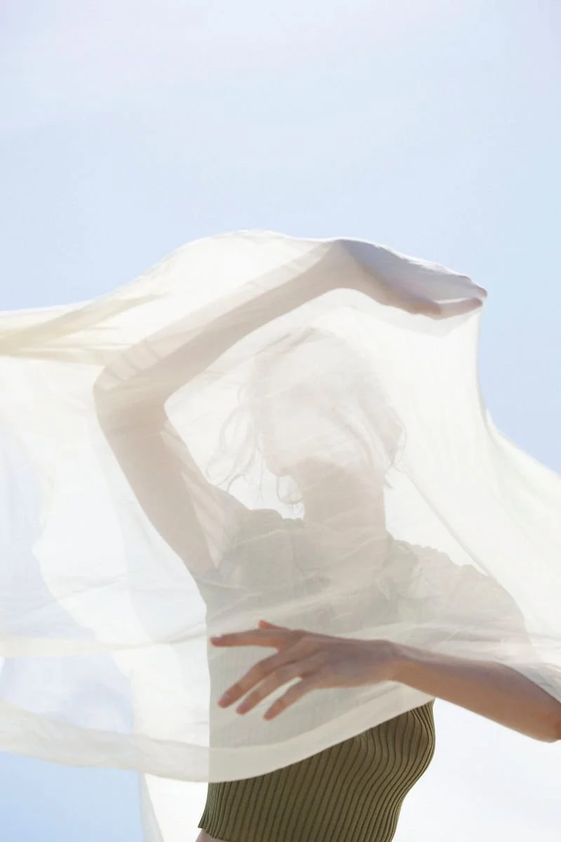
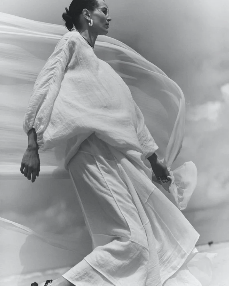
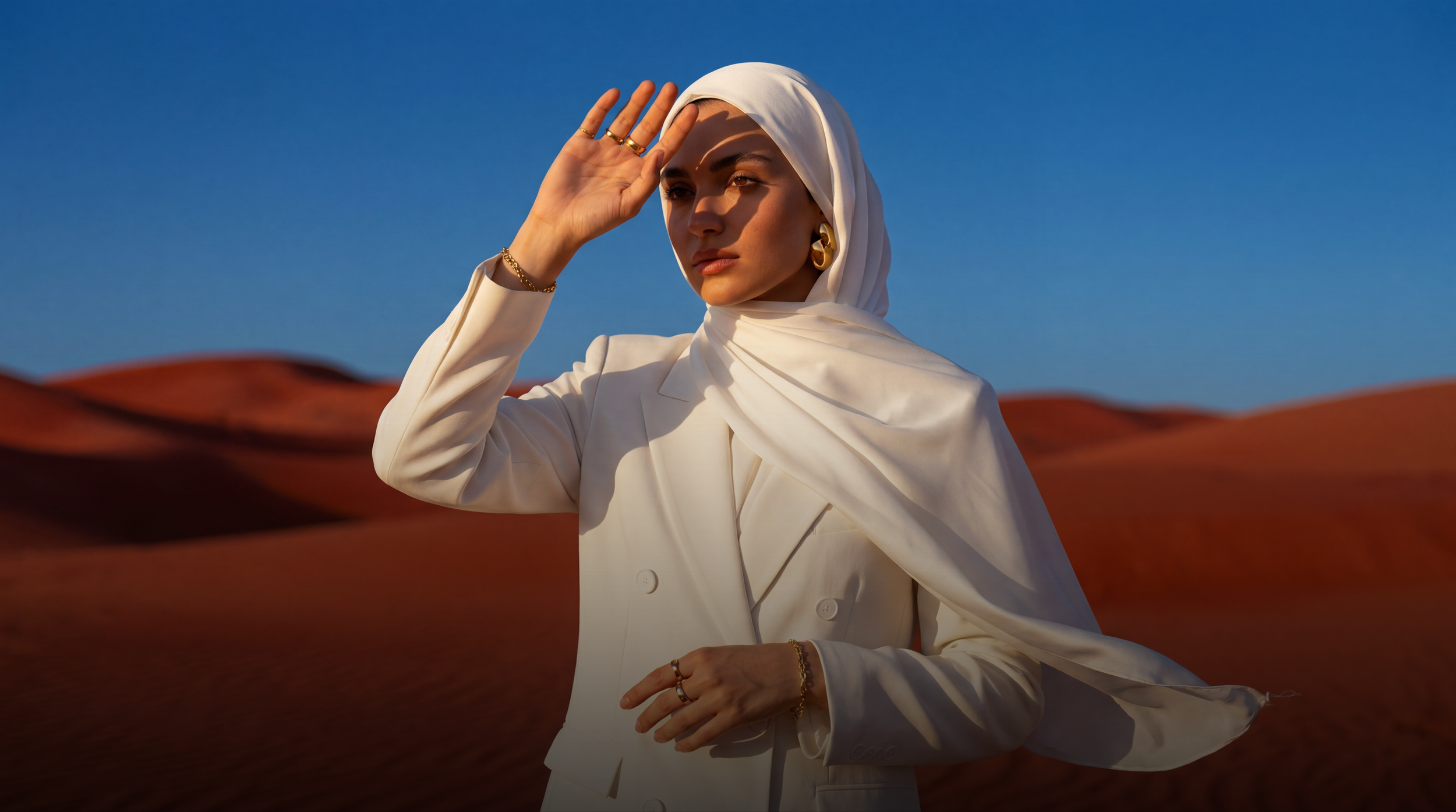
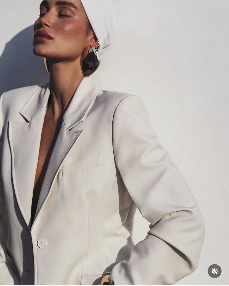
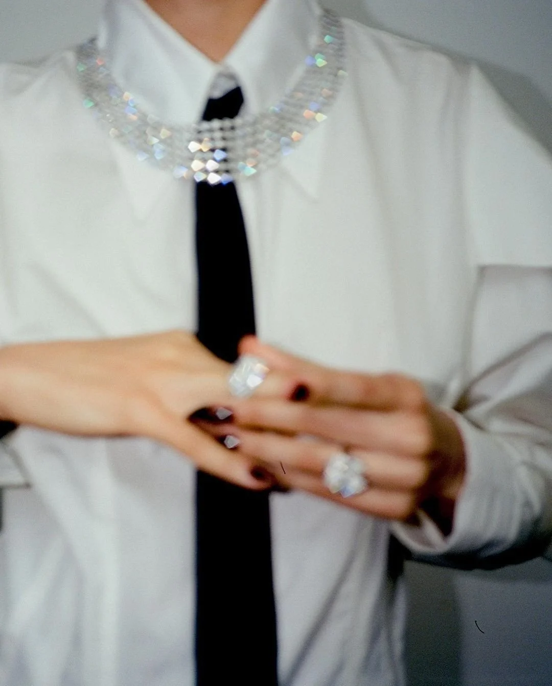
This concept captures the spirit of the contemporary Arab woman — a power figure navigating her professional and social life with confidence, elegance, and grace.
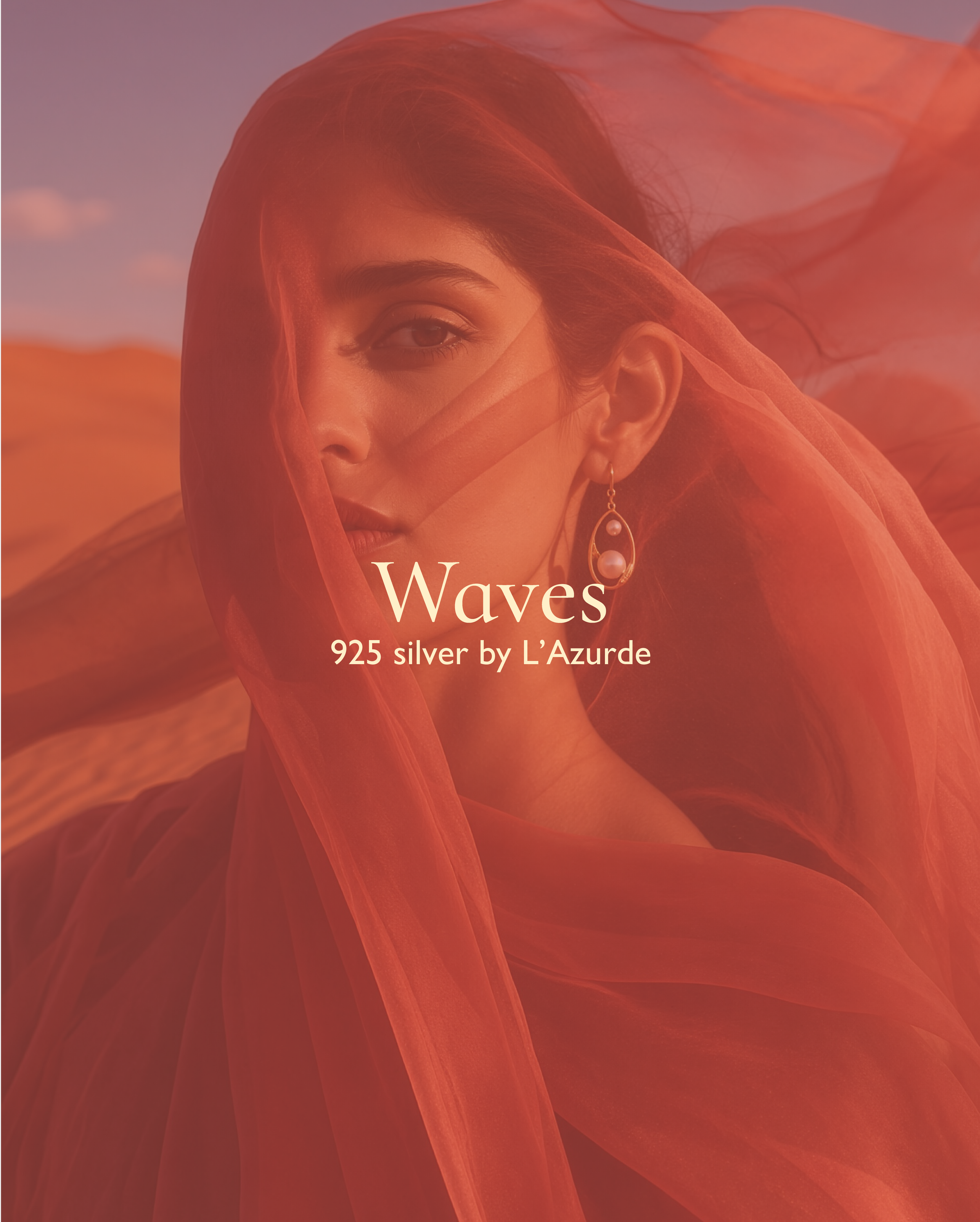
She may wear a hijab or not, but she always embodies refinement and strength. The visual story blends tradition and modernity, individuality and modesty, visibility and mystery.
Two visual scenarios unfold:
In one, she appears in a tailored suit with a tie, standing against a desert landscape or the walls of traditional architecture — a powerful symbol of two worlds meeting.
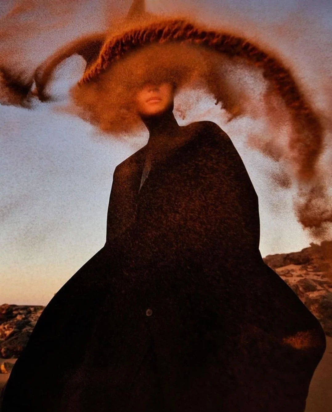
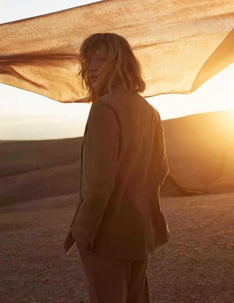
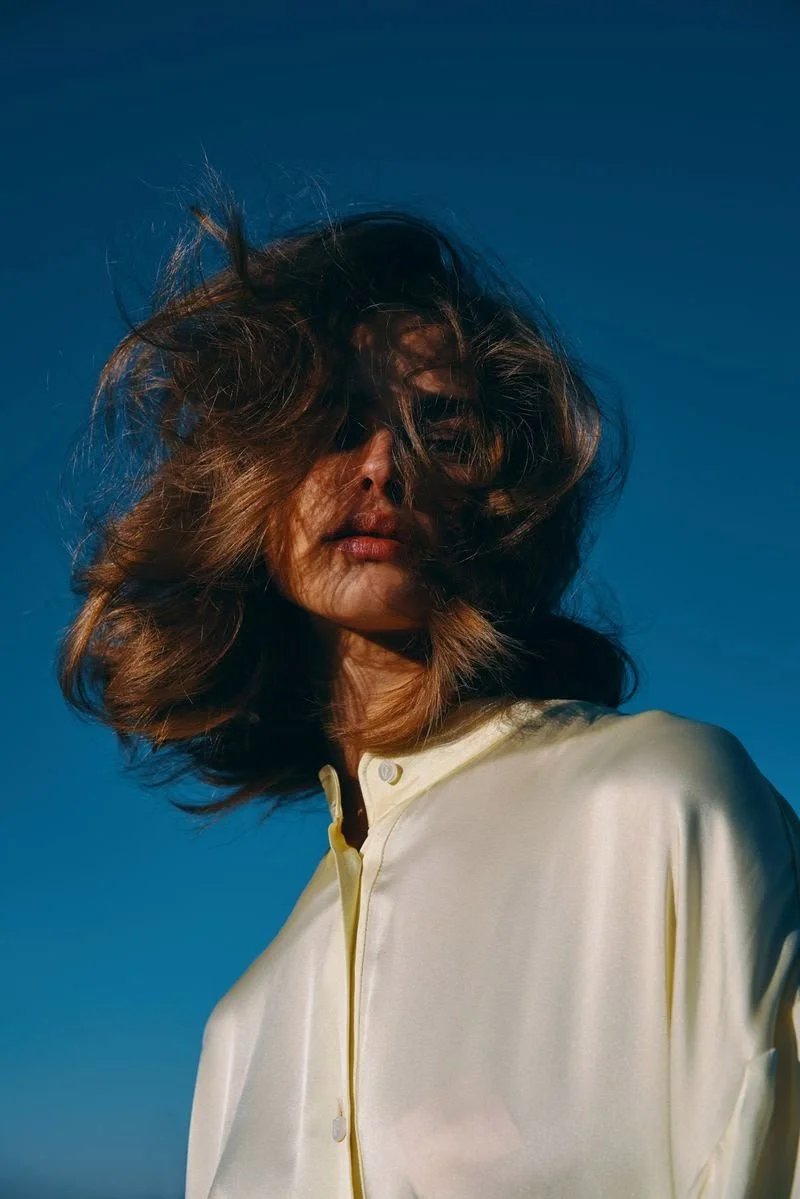
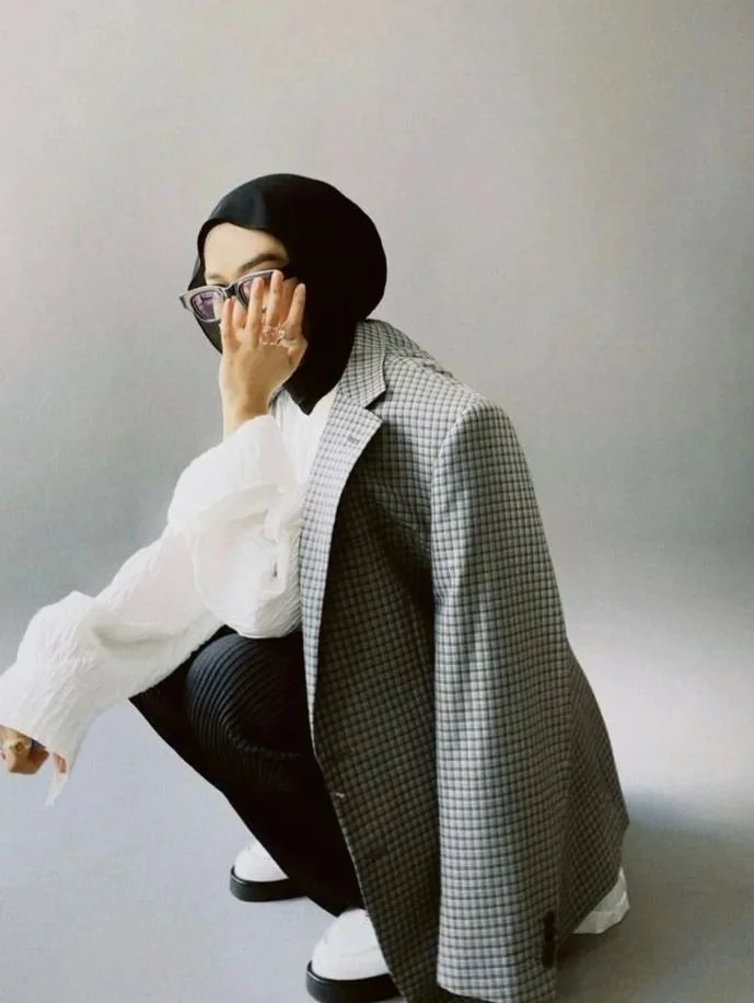
In the other, flowing fabrics move with the wind, embracing or partially revealing her form — gestures and poses become the language of presence and identity.