

Logo, Apparel Print & Team Visual Identity
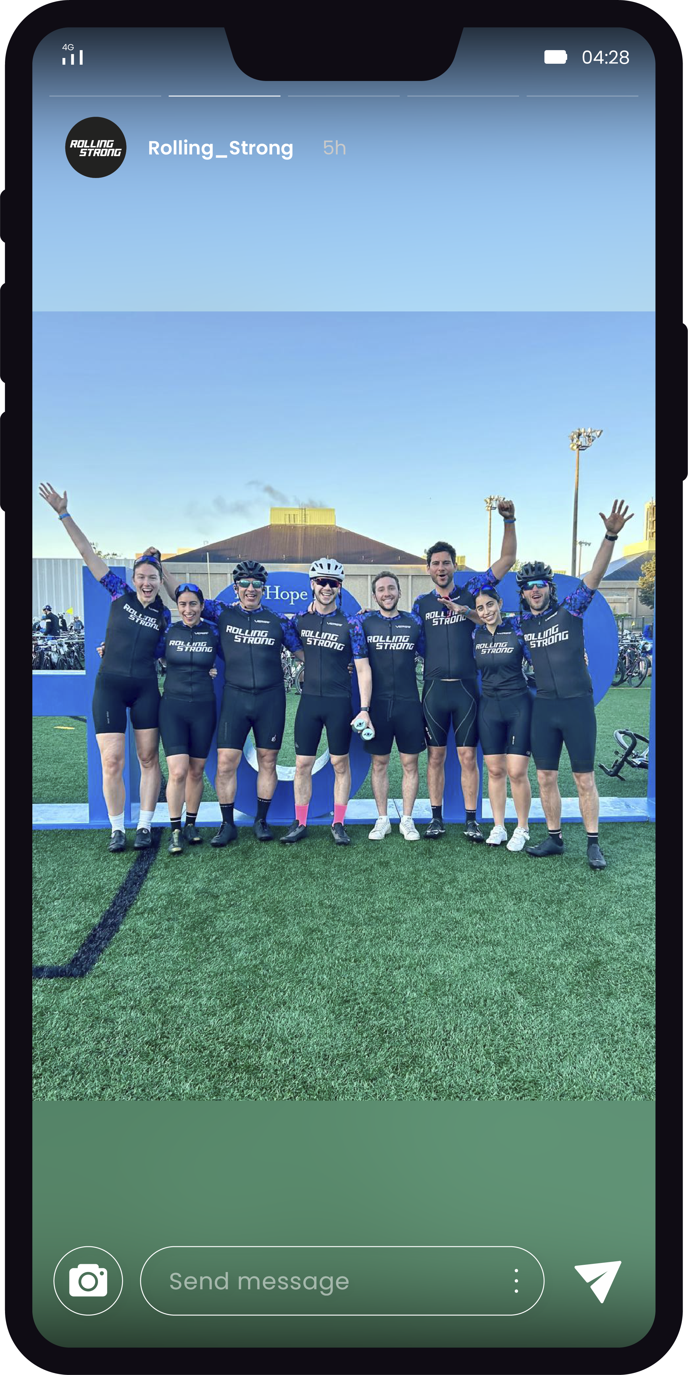
Rolling Strong is a cycling team identity created for The Ride to Conquer Cancer charity race
The project focused on creating a logo, cycling uniform design and seamless textile print for a team participating in The Ride to Conquer Cancer charity race.
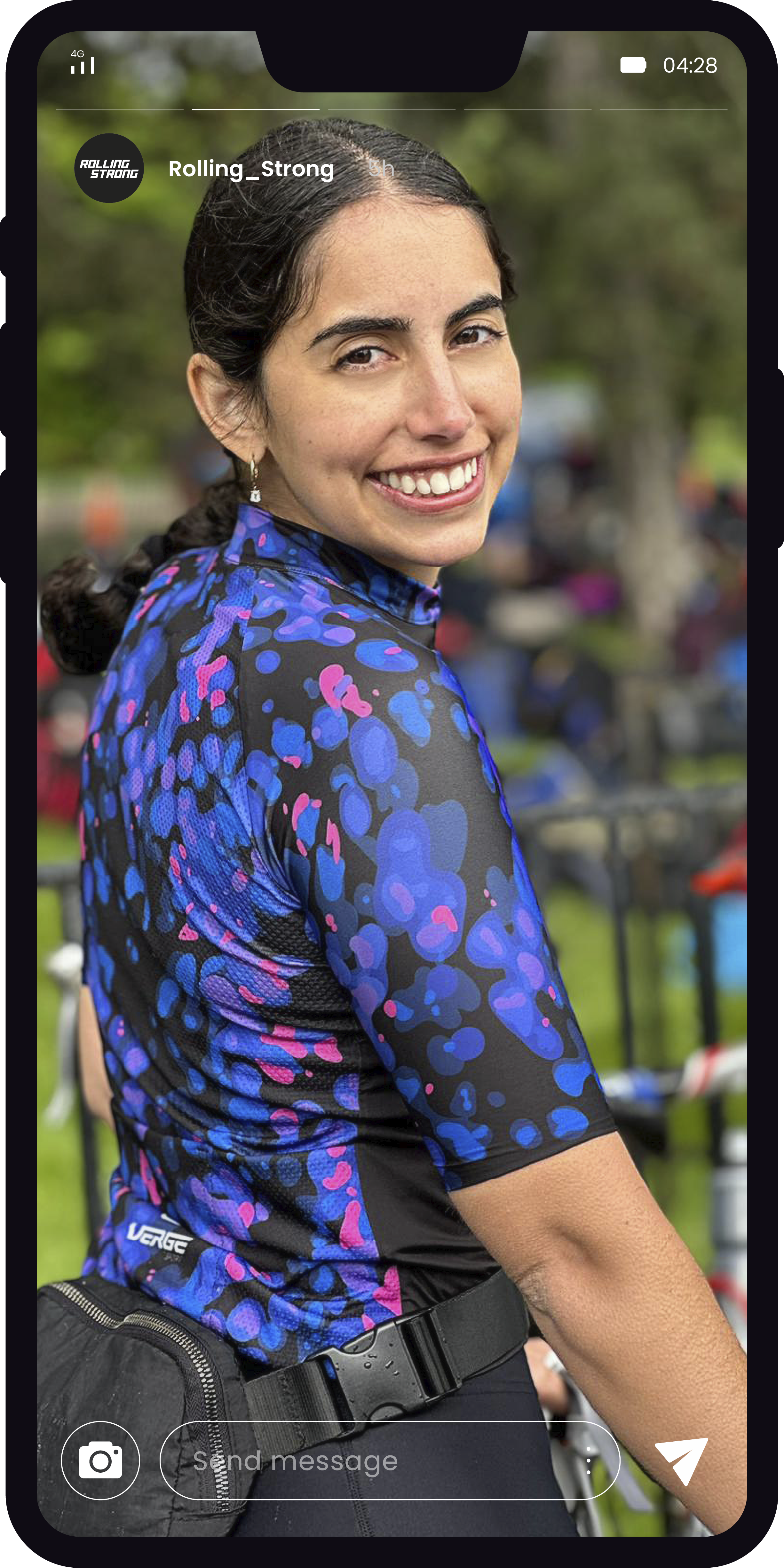
The visual concept was inspired by microscopic cell imagery, translated into an abstract pattern that covers the sleeves and back of the jersey. Combined with a bold black front and a dynamic white logo, the design creates a strong, recognizable team presence built around movement, resilience and determination.
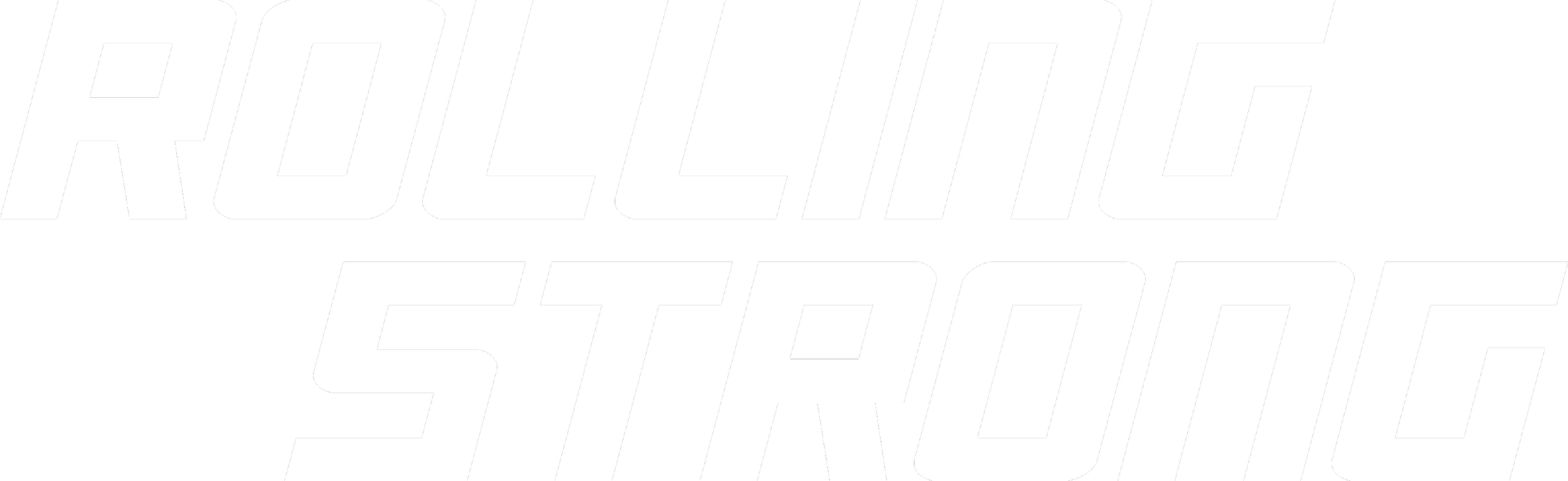
Logo Design
The Rolling Strong logo was designed as a bold, dynamic wordmark with a strong sense of movement.
Its angular shape and forward-leaning rhythm reflect speed, endurance and determination — key qualities behind both the cycling team and the charity race.
Textile Print
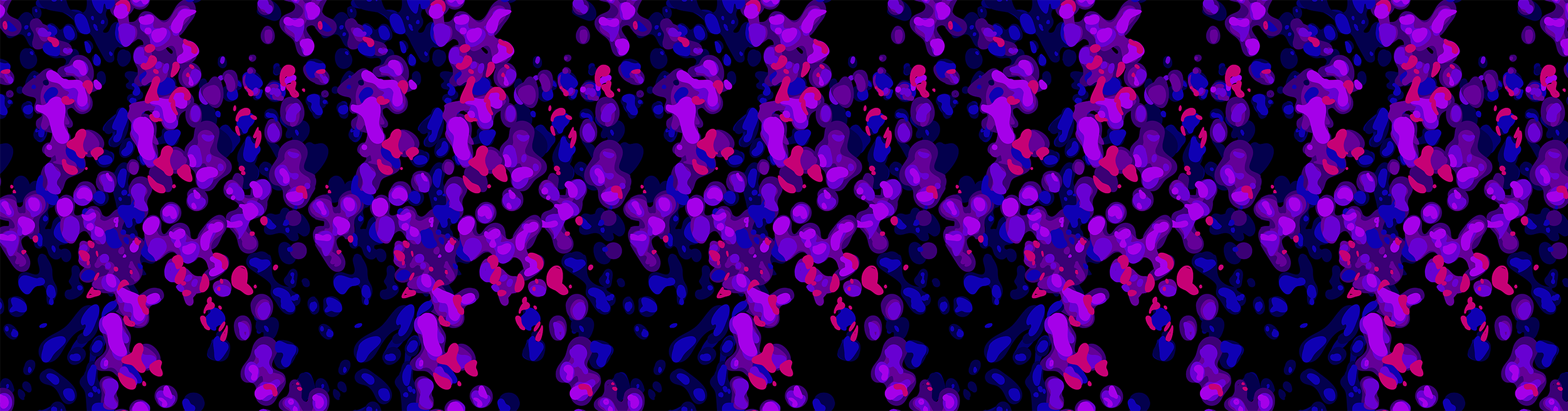
The seamless print was inspired by microscopic cell imagery and transformed into an abstract visual pattern.
The combination of deep blue, violet and pink tones creates a sense of energy and depth, while the organic shapes add emotional meaning to the uniform without making the concept too literal.
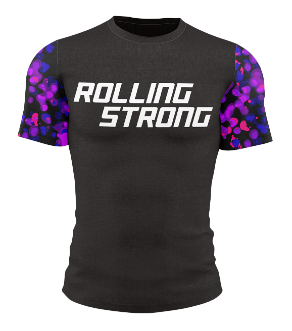
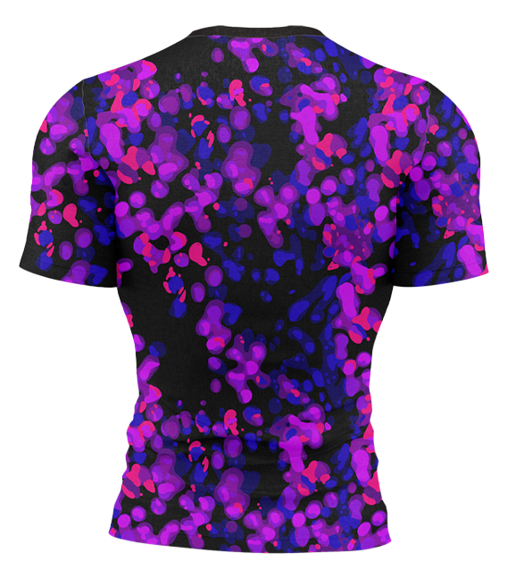
Cycling Uniform Design
The uniform combines a clean black front with a strong white logo and a full-pattern application across the sleeves and back.
This contrast allows the team to remain visually recognizable from the front, while the printed back creates a more expressive and memorable visual impact during the race.
Visual Outcome
The final design creates a distinctive cycling identity that feels energetic, emotional and purposeful.
By combining a dynamic logo with an abstract cell-inspired print, Rolling Strong becomes more than a team uniform — it becomes a visual symbol of movement, resilience and support.