Brand Collaboration. Event Visual Direction
Moscow Sport × GDBD is a collaboration concept shaped by movement, discipline and collective energy.
Created for Sports Day in Moscow, the project brought together the institutional identity of Moscow Sport and the bold athletic language of GDBD through a unified visual system.
The design included a collaboration mark, printed gift cards, flyers and 3D sticker assets — all built around rhythm, motion and the idea of connection through sport.
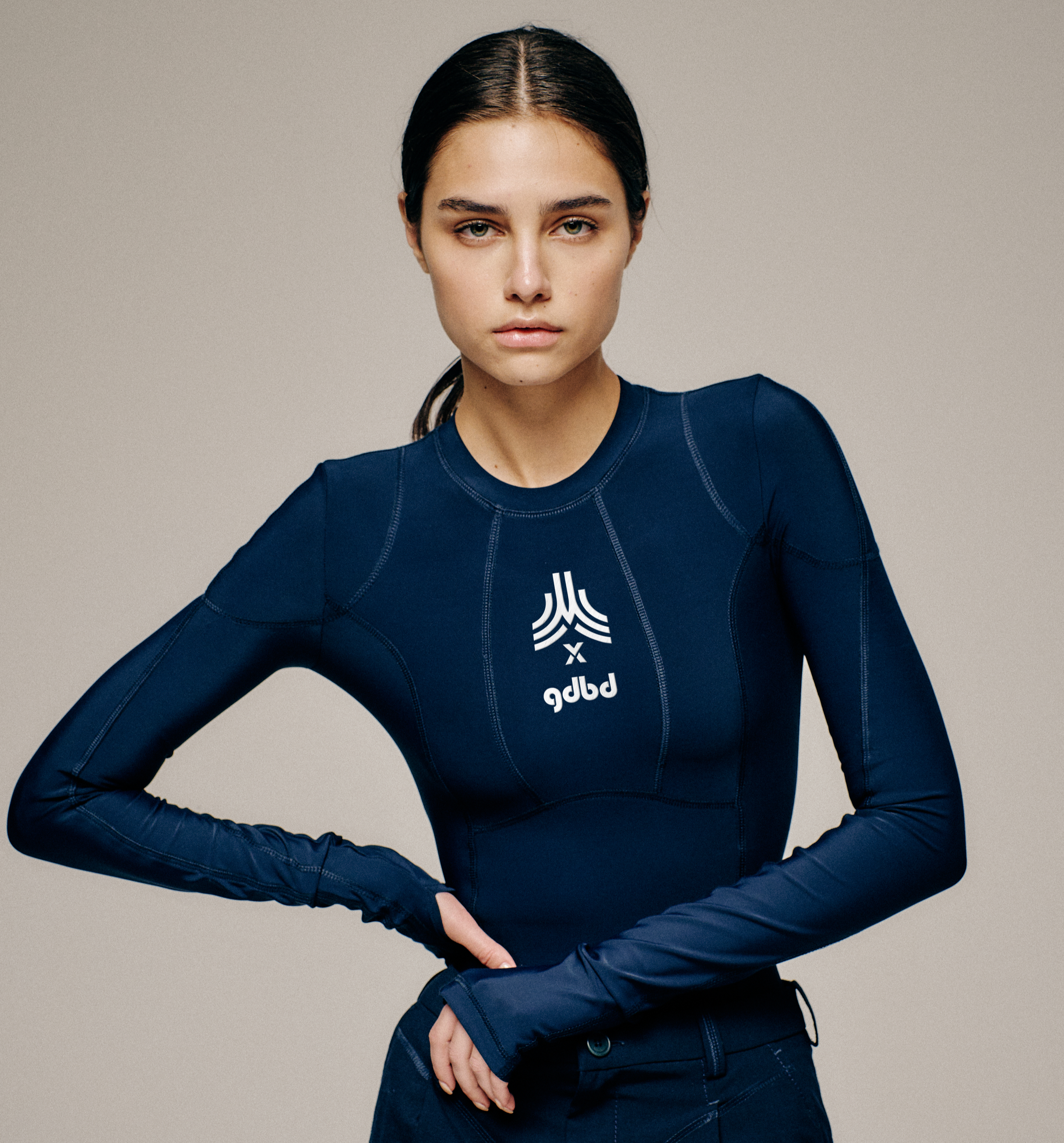
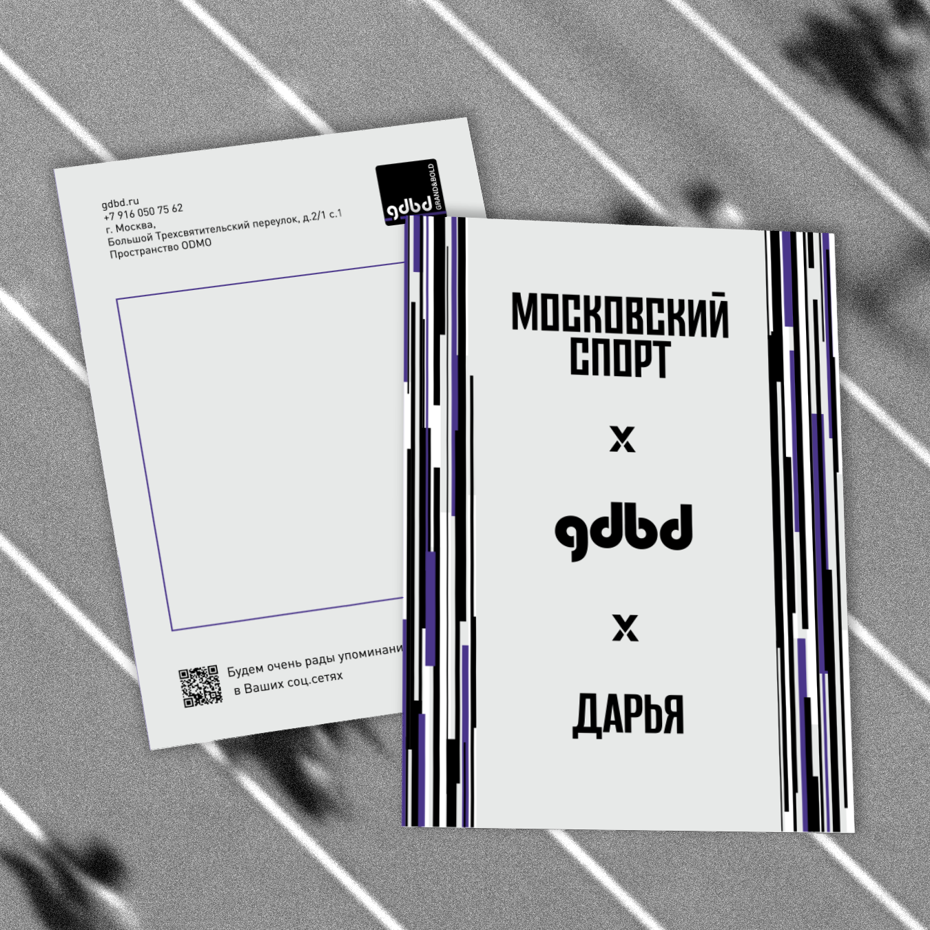
Collaboration mark.
The visual symbol of the collaboration is built around the “×” sign — a simple graphic element that connects the two brand identities while creating a sense of movement, crossing and shared direction.
The mark works as a flexible visual anchor across printed and digital materials, helping Moscow Sport and GDBD appear as part of one unified event communication system.
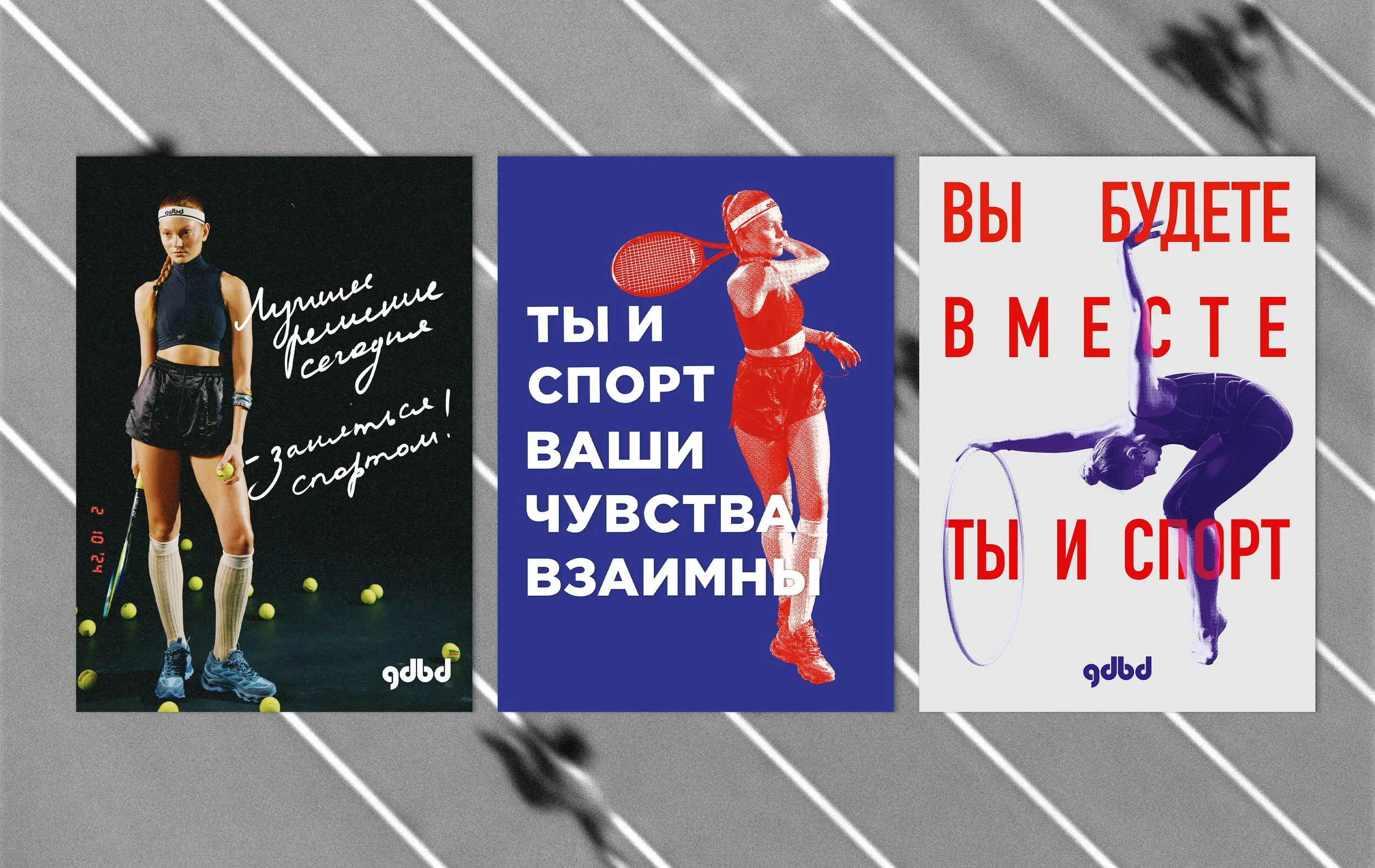
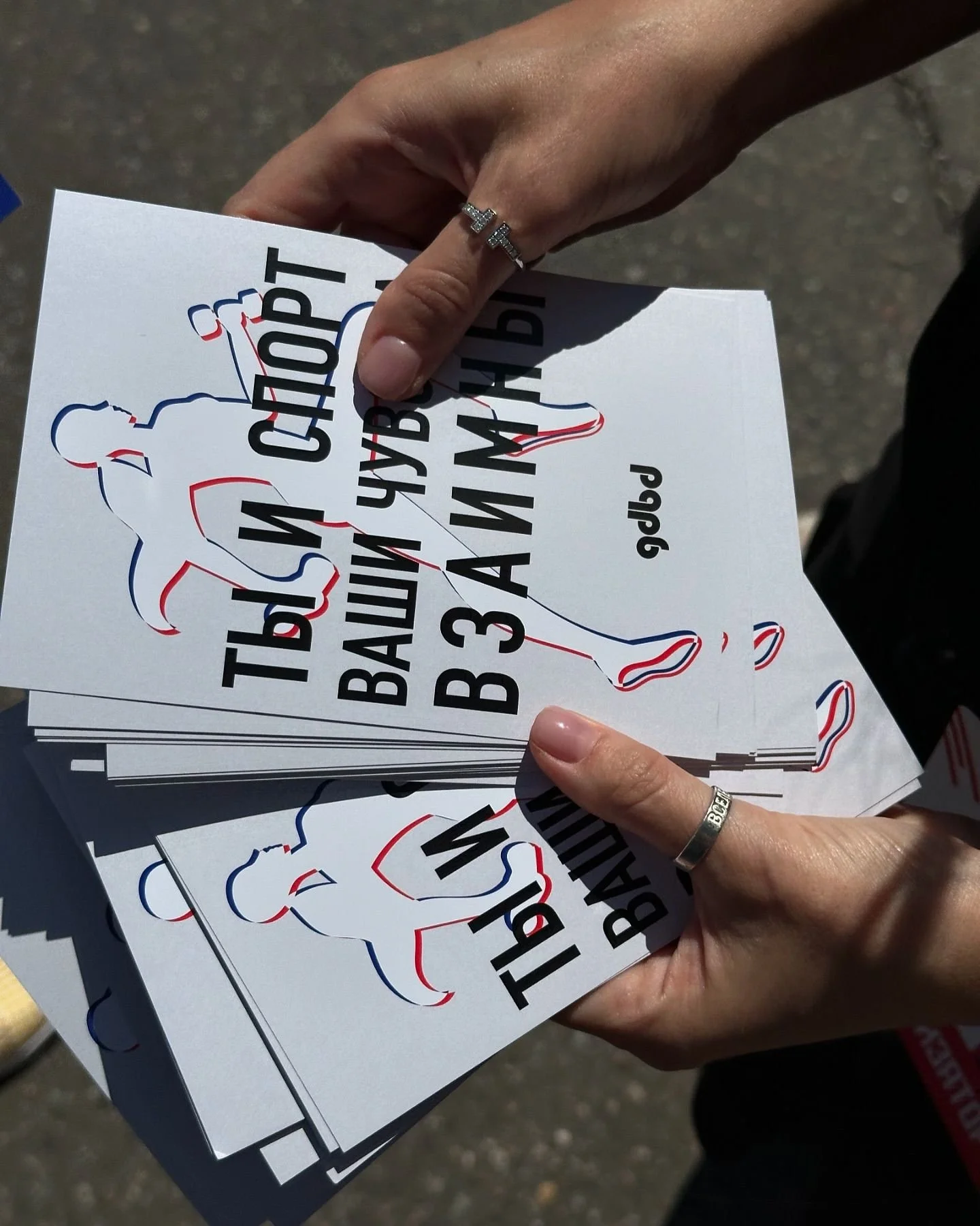
Event flyers
The flyer system was created to communicate the energy of the event through bold typography, athletic imagery and dynamic compositions.
Each flyer combines motivational phrases, movement-based visuals and GDBD’s graphic language to create a direct, energetic and sport-focused message.
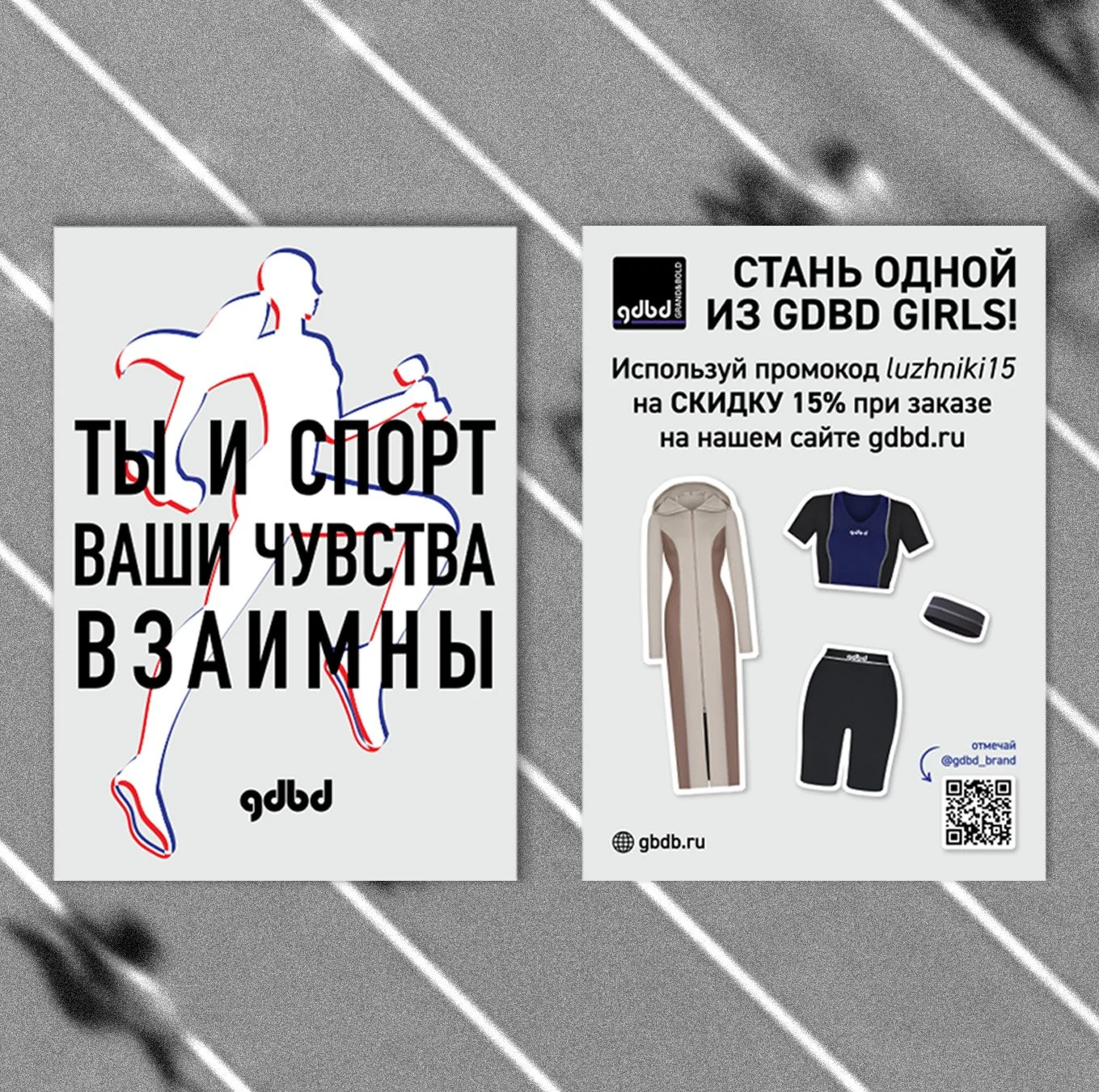
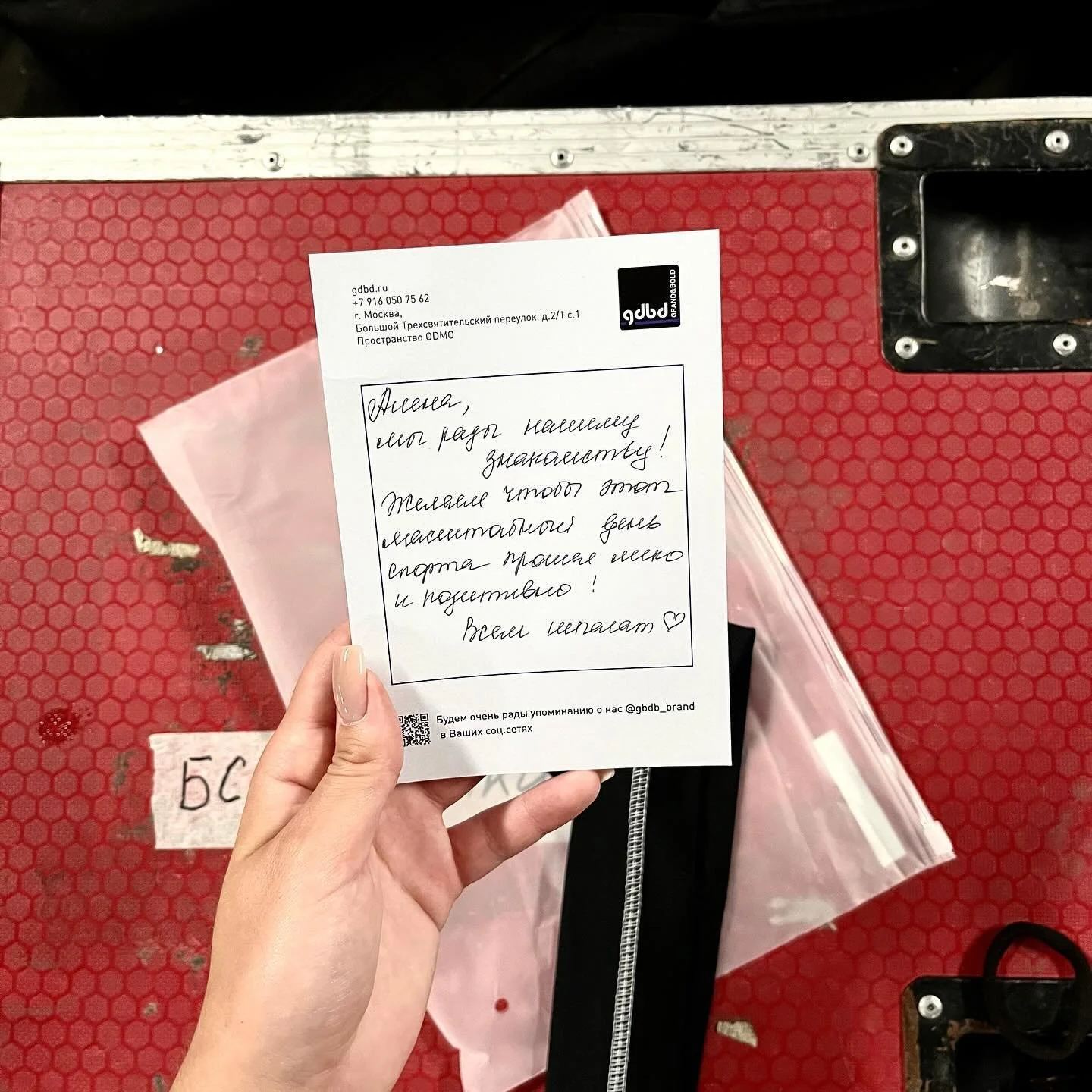
Coach Gift Cards
The gift cards were designed as personal printed pieces for the coaches participating in the event.
Each card uses the collaboration mark, brand logos and dynamic line patterns to create a sense of recognition, appreciation and equal presence within the project.
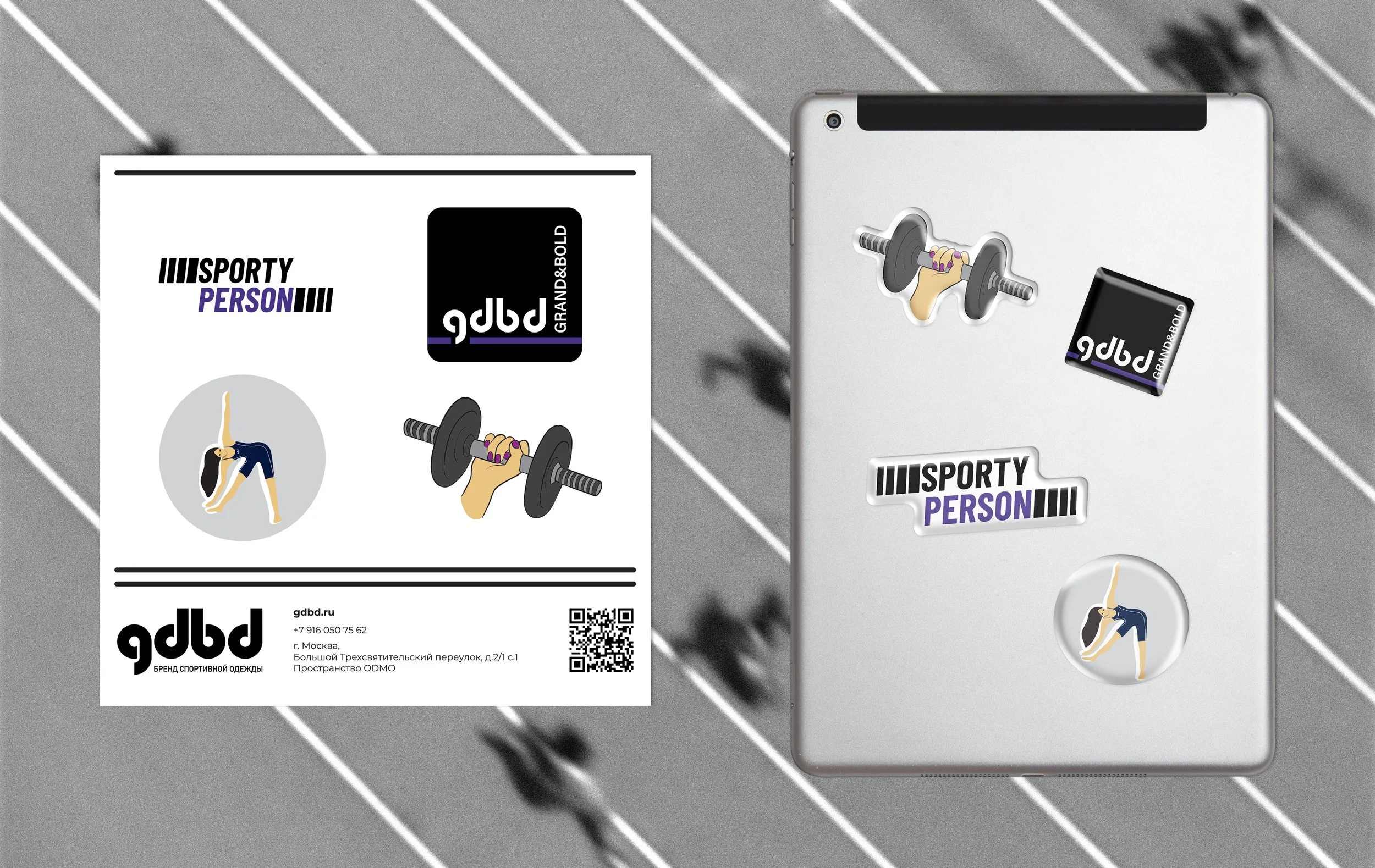
A set of 3D stickers was created to extend the collaboration identity into digital communication.
The stickers combine sport-related objects, brand elements and playful visual symbols, allowing the event identity to live across social media, stories and informal brand touchpoints.
3D stickers