Brand Identity & Graphic System.
PEPELWRLD is a streetwear identity concept built around visual distortion, dark nostalgia and underground energy.
The name PEPEL comes from the Russian word “пепел”, meaning “ash” — a symbol of what remains after fire, destruction and transformation.
Inspired by VHS noise, retro horror aesthetics and dark symbolic references, the project translates the brand’s rebellious character into a graphic system for apparel, labels, posters and print applications.

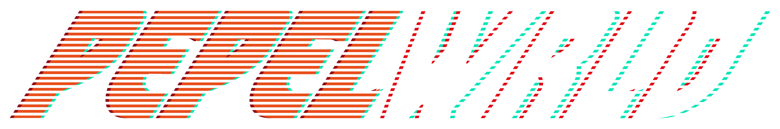
Logo System
The PEPELWRLD logo was designed with a distorted retro structure, combining bold lettering with scanline effects, layered noise and chromatic shifts.
The split between orange and white creates a strong visual contrast, while the VHS-inspired treatment gives the identity a sense of movement, tension and analog imperfection.
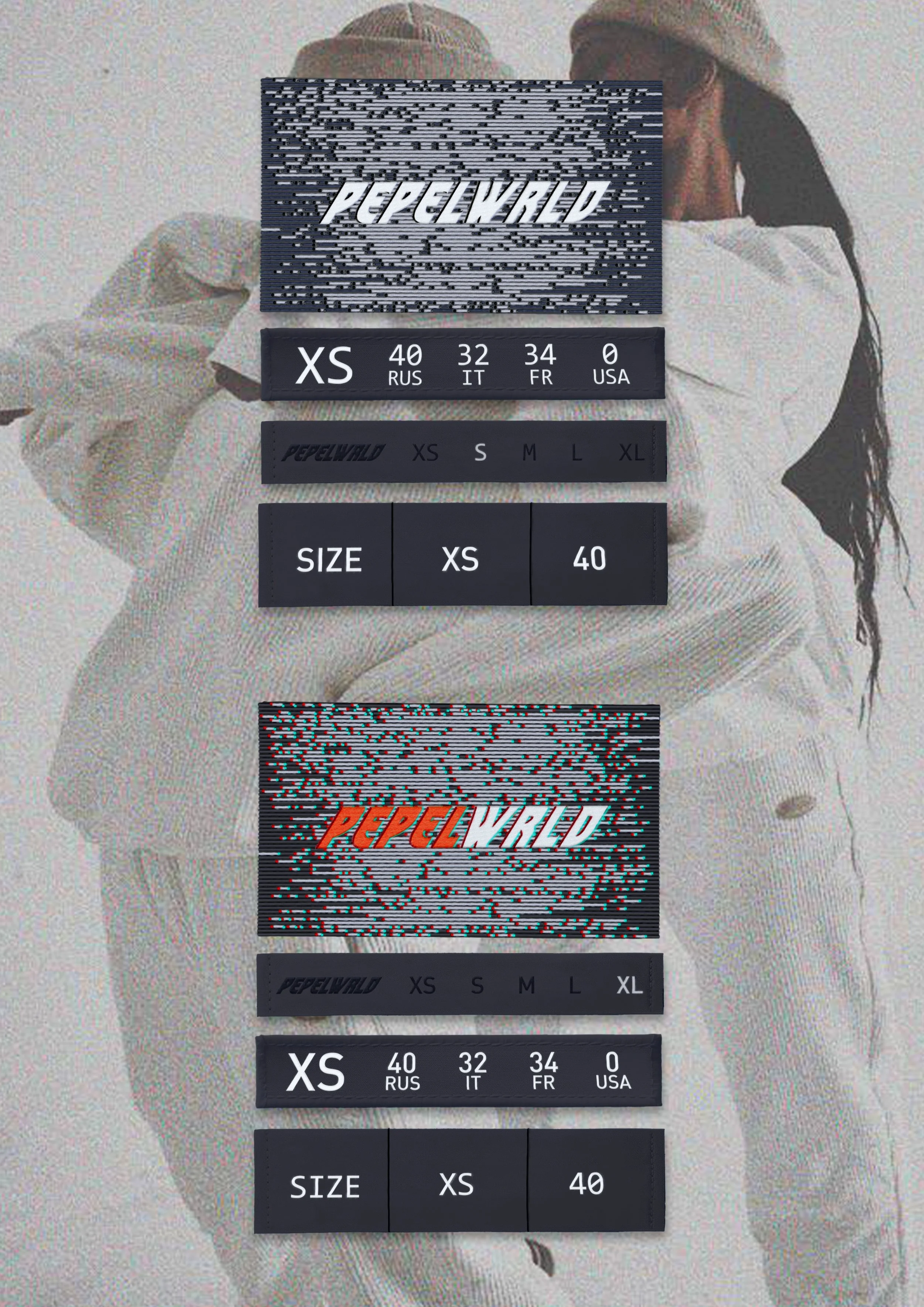
Labels & Garment Details
The label system was developed as a functional extension of the identity, including size labels, patch labels and apparel applications.
Each element combines brand information with distortion-based graphics, allowing even small product details to carry the same dark and recognizable visual language.


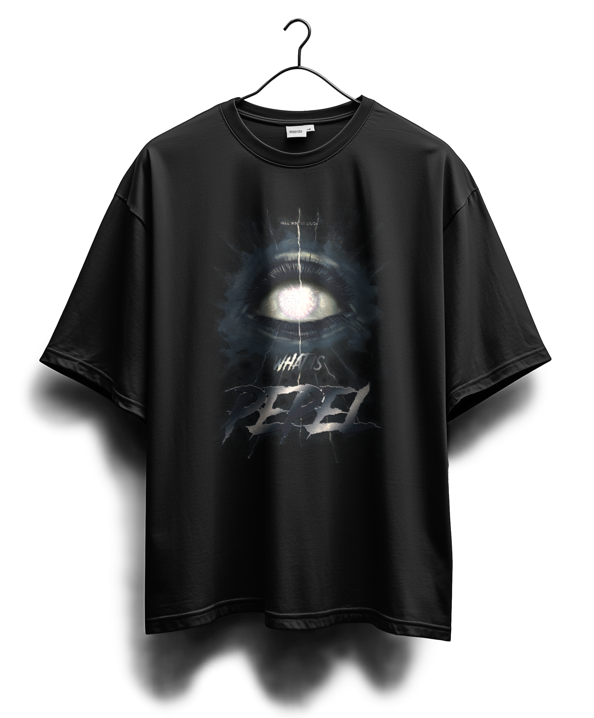
Poster & T-shirt Print
The poster and T-shirt graphics extend the brand identity through symbolic imagery, dark textures and vintage-inspired compositions.
The eye motif, layered surfaces and degraded print effects create a visual connection between apparel, music-culture graphics, retro horror and underground poster design.
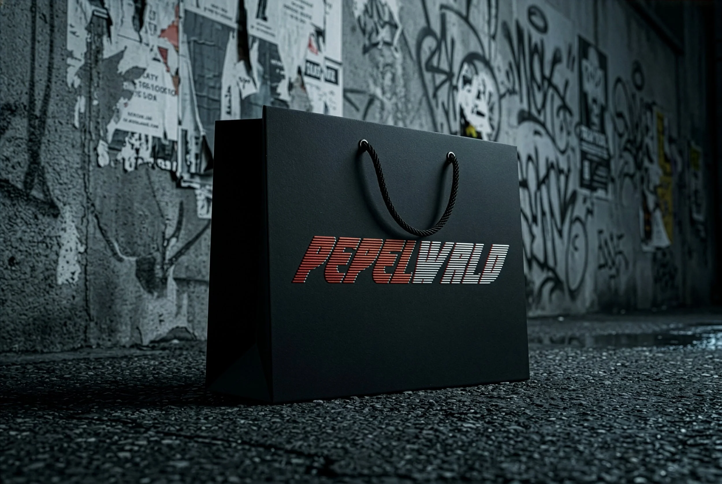
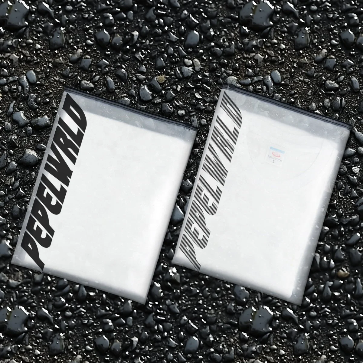
Packaging
Translucent garment bags and a black paper shopping bag bring the brand’s dark, distorted visual language into physical touchpoints — balancing raw streetwear energy with a clean, recognizable logo system.